Often, graphic designers, and specifically those of us who specialize in corporate images (or branding (If we adopt a more Anglo-Saxon approach), we find ourselves in a situation that terrifies us and simultaneously fills us with professional anxiety: How to redesign a logo. However, this isn't always an easy task. We don't know where to begin: how to define the new logo, whether it will be well-received, whether the new version is more visible, etc. As professionals, we have to answer our clients' calls and meet their needs, whatever they may be.
 Our project: Aurea Training
We can talk about a case we handled a few months ago, that of Aurea Formación. This company informed us that they needed to update their corporate image, focusing it on various activities, but especially their online presence. After several meetings with the managers, we reached a conclusion about what we should and shouldn't do.
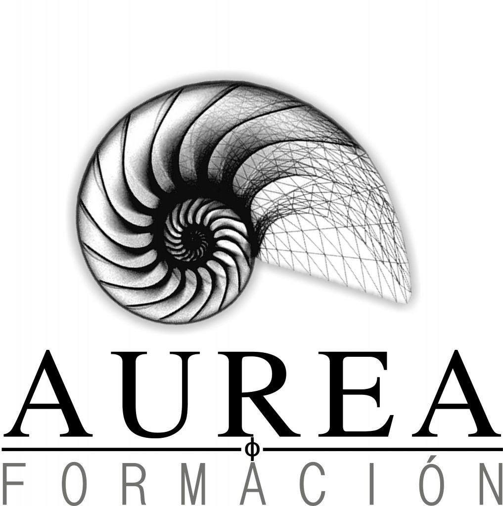
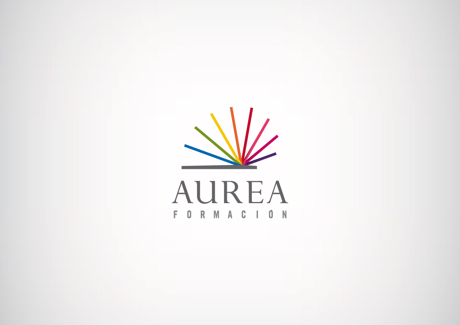
As we saw in the previous logo, we tried to maintain a similar shape and, to some extent, adhere to the basic principles of the golden spiral and the concept of the golden ratio in mathematics. However, to break the monochrome of the previous logo, we wanted to give it a more diverse character by using colors that perfectly complement the more sober image conveyed by a color like gray. This is also reflected in the typography: one font has a classic style (Perpetua), and the other is much more contemporary (Trade Gothic). The result, as you can see, is as follows:

Four practical tips on how to redesign a logo
- It addresses the needs of the client.It's essential. Ask them all the necessary questions, no matter how silly they may seem: whether they have a preference for a particular font, color, or shape, or if they need to incorporate new elements… Gather as much information as you can. This will aid the creative process and also contribute to the client's satisfaction with your work.
- Add value to your work.Design the necessary logo proposals, always dedicating the time you've allocated to this project. Once created, present them to your client, explaining every detail of your work, how you created each element, and its purpose. If you meet with them (or with them if there's more than one), I recommend avoiding highly technical terms. Unless they're an expert in the field, avoid them: your client doesn't need to know about Pantone colors, serif fonts, or reserved spaces; they just want to see the final result.
- Add a sketch of the logo in one of its applications..That is, if you create a logo, show it how it would look on a business card, a coffee mug, or any other application you deem appropriate. What's our goal? To inspire the client through the design, to make them feel that the logo is uniquely theirs and that they could use it to identify with the brand.
- Create a corporate identity manual.Educate your client. Justify your work by showing them the benefits of having a manual like this: they'll be able to use the logo independently without having to ask how. Highlight aspects that are often overlooked by clients, such as logo design, colors, typography, and incorrect usage. Especially the latter, which is a practice that most small and medium-sized businesses tend to disregard.
As you can see, we solve these types of problems with our design and marketing team, capable of providing an unbeatable quality service for each of our clients.
